11.28.2010
11.09.2010
Amos Lee
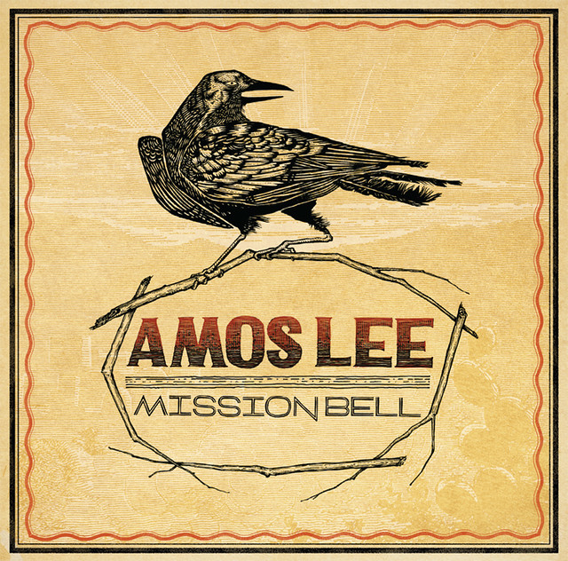
About a month after school let out, the fabulous Burton Yount contacted me about joining him to create album art for Amos Lee's new release, Mission Bell under EMI's Blue Note Records.
I was really excited to be a part of this project from the beginning. This will probably be the most viewed piece of artwork I have created so far!
I was first asked to create custom lettering to go along with a photograph, but it soon turned out that Burton was looking for something a little more interesting. We did multiple versions of different themes until we got to our final:
"Amos Lee has announced the January 25, 2011 release of Mission Bell, his fourth album for EMI's Blue Note Records, and his richest and most fully formed album to date. Mission Bell, which was produced by Joey Burns of the acclaimed band Calexico, displays both range and cohesion, an array of emotions unified by Lee's eclectic taste and distinctive vocals. With a remarkable set of guests--including Lucinda Williams, Willie Nelson, Sam Beam (Iron & Wine), Priscilla Ahn, Pieta Brown, and James Gadson--and the musical backing of Calexico, the album marks the arrival of Amos Lee as a mature artist who continues to explore his musical and thematic interests." -from Amazon's Product Review
The music is amazing, and this album is definitely going to be well received. We worked off of the western undertones and poetic lyricism to create a feel true to the music. Check out the sketch for the final below. Amos really wanted to keep things masculine, so the floral elements were out.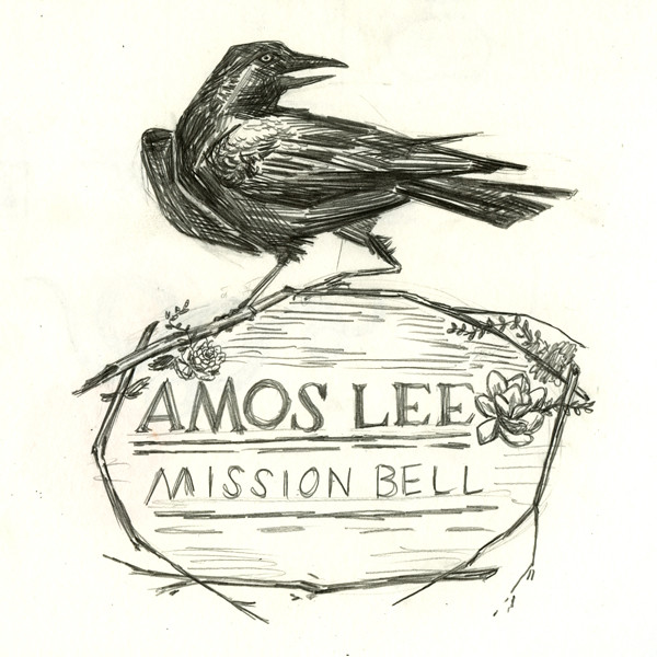
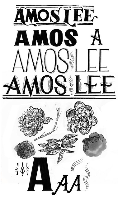
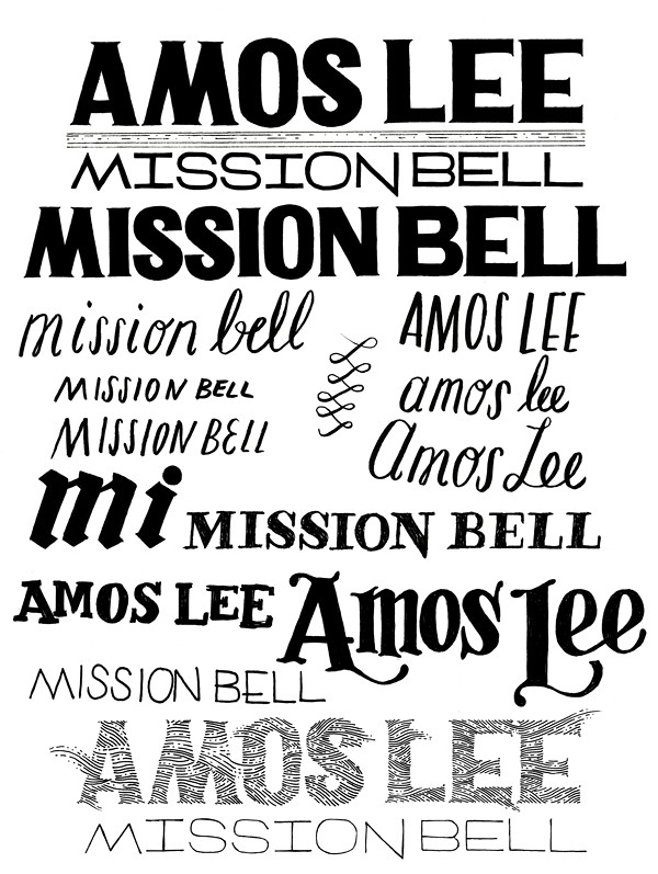 The typography was a challenge. One thing that we really found necessary with this project was not to be obvious. Sure, we wanted something Western, but we wanted to stray far far away from "cowboy." See some of my other thoughts below. At first we started with photographs of Amos. Here are some earlier versions before we really found the direction everyone agreed on.
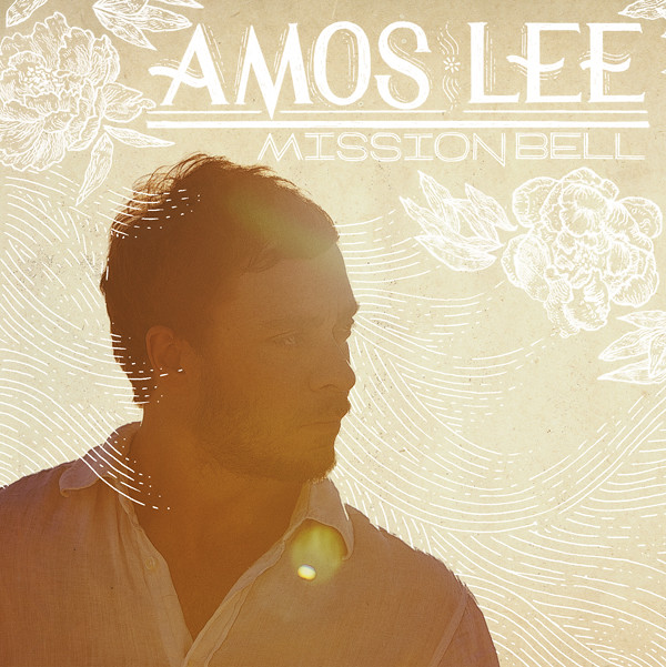
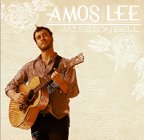
I was really excited to be a part of this project from the beginning. This will probably be the most viewed piece of artwork I have created so far!
I was first asked to create custom lettering to go along with a photograph, but it soon turned out that Burton was looking for something a little more interesting. We did multiple versions of different themes until we got to our final:
"Amos Lee has announced the January 25, 2011 release of Mission Bell, his fourth album for EMI's Blue Note Records, and his richest and most fully formed album to date. Mission Bell, which was produced by Joey Burns of the acclaimed band Calexico, displays both range and cohesion, an array of emotions unified by Lee's eclectic taste and distinctive vocals. With a remarkable set of guests--including Lucinda Williams, Willie Nelson, Sam Beam (Iron & Wine), Priscilla Ahn, Pieta Brown, and James Gadson--and the musical backing of Calexico, the album marks the arrival of Amos Lee as a mature artist who continues to explore his musical and thematic interests." -from Amazon's Product Review
The music is amazing, and this album is definitely going to be well received. We worked off of the western undertones and poetic lyricism to create a feel true to the music. Check out the sketch for the final below. Amos really wanted to keep things masculine, so the floral elements were out.


 The typography was a challenge. One thing that we really found necessary with this project was not to be obvious. Sure, we wanted something Western, but we wanted to stray far far away from "cowboy." See some of my other thoughts below. At first we started with photographs of Amos. Here are some earlier versions before we really found the direction everyone agreed on.

The one above was one of my favorites!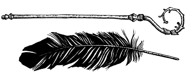
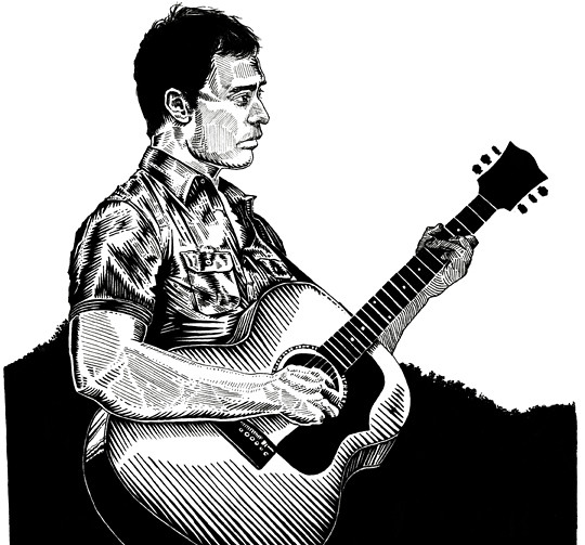
Over the past few weeks Burton has been wrapping up the final design for the booklet and asked for some spot illustrations and a portrait for the back cover.
So that's that! Keep your eyes out to see it in stores, in the iTunes store, and on Amazon. And if you want to pre-order the album, which drops January 25th, visit the Amazon page!
11.08.2010
9.09.2010
super secret sneak peek
6.08.2010
Very Important Posters
My thesis series, Very Important Posters, is up in full on its own site! Check out the entire series, buy a few if you are so inclined, and read the project's statement. I'm also thinking about adding some process shots on a new page... Spread the word!


6.07.2010
5.28.2010
5.19.2010
You Saw
 A gift for a friend and mentor, Whitney Sherman. Micron pen and white Jelly roll pen on toned paper.
Also, guess who is a proud owner of a Bachelor of Fine Arts? Stefan Sagmeister was my class's commencement speaker and I got the chance to meet him in the morning. I know, right?!
 He was surprisingly huggable.
Next step: design and create an awesome self promotional mailer that will make art directors everywhere want to know and hire me!
4.29.2010
Screen Printed Business Cards
So I caved and went with GotPrint. After much pressure from my peers I left my tried and true overnightprints.com. I have no idea how these cards will turn out, though, so I decided to do a run of handmade cards. I found a whole ton of scraps in the print shop (someone had cut off the bottom two inches of some forty pieces of paper) with a deckled edge so I designed the card to that. The paper is cut to 4.25" wide, so they are .75" longer than standard cards. The fancy run has five colors on the front and one color on the back, the more basic run has two colors on the front and one color on the back in two version (silver/black and teal/black).


I love how these turned out! I had to print these ONE BY ONE. Next time I'm definitely pulling a whole sheet of cards and THEN cutting them!


I love how these turned out! I had to print these ONE BY ONE. Next time I'm definitely pulling a whole sheet of cards and THEN cutting them!
4.27.2010
Lust and Chastity


These guys are a final for Dan Krall's class. I still feel like I haven't figured out how I want to draw the figure and faces, but I feel like with these I'm getting closer. I wish I had more time to focus on the lettering, but I've been trying to work faster/looser with my lettering so maybe it's successful in that sense!
Ladies are wearing Martin Maison Margiela's amazingly weird wig coats and sitting on Eames molded plywood and Barnes&Barnes chairs.
4.15.2010
CD Designs!


Here are two potential CD designs for a digital portfolio. Seniors in the Illustration department are designing these for a Skype chat we're doing with art directors at the Society of Illustrators in NYC. Which do you like best?
UPDATE: I ended up getting the first one printed as it was the obvious favorite! Thanks for the input, guys!
4.09.2010
Business Time
It's business time in the Illustration department and seniors are going nuts all over the studios about self promotion. It must be every few hours that I hear someone ask "Where did you get these printed?" or "You know how to letterpress?" Many seniors have already gotten their cards made and have a finished portfolio, but since my deadline to have these things isn't until the end of the month I get to spend some time with the design. I've settled with overnightprints.com before and I was more than prepared to do it again. But today I did a little flickr browsing to get inspiration and remembered how great the business card can be as an object in itself. Now I'm thinking that handmade and hand printed may be the way to go this time.
Check out some of the great cards I saw today and also be sure to click through to the artist's webpage!


Check out some of the great cards I saw today and also be sure to click through to the artist's webpage!


4.06.2010
Toile!!!

I've always had this unabashedly tacky attraction to toile patterning, which may or may not have something to do with my childhood obsession with being a British colonist. So when Babs gave me the prompt to create a 3-part illustration incorporating photographs of accessories I first tried to fight off the urge to go this route. In the end, the toile always wins.
The pink shoes are by Harumi Muto, the necklace by Shourouk, and the silver shoes are by Christian Louboutin. Photos from Luisaviaroma.com.
Heather saw me working on this and showed me this awesome Threadless tee. Totally want it!

3.26.2010
Native Appropriations
 My drawing (above) has made its rounds around the interwebs for various bizarre reasons. But really, who doesn't love making fun of hipsters? It's also been featured on the very cool blog, Native Appropriations, in a post hilariously titled The Strange Case of the Hipster Headdress. Adrienne makes a great point of showing hipsters who wear the fashions almost accidentally, on purpose but with no reason, and then also with feminist purposes. My big problem with the whole thing is that dressing like a "native" is as much as a novelty as wearing those Kanye "sun"glasses. Go irony?
3.11.2010
3.10.2010
Subscribe to:
Comments (Atom)


